ART // MURAL
Illustration
Painting
Videography
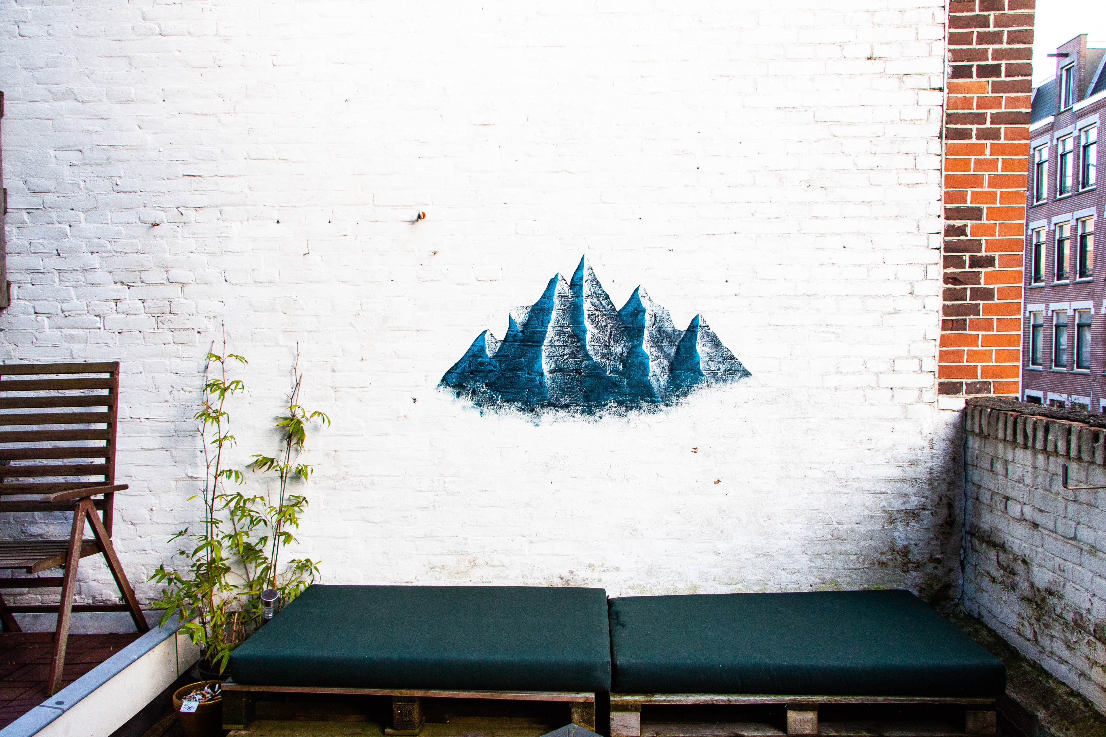
The terrace wall in my Amsterdam apartment is a blank canvas; a perfect opportunity to be transformed into a work of art. As a creative exercise, I challenge myself to create a new design on this wall every few months, experimenting with different colors and painting styles. The idea is to incorporate something from the previous design into the next one. This is an ongoing project.
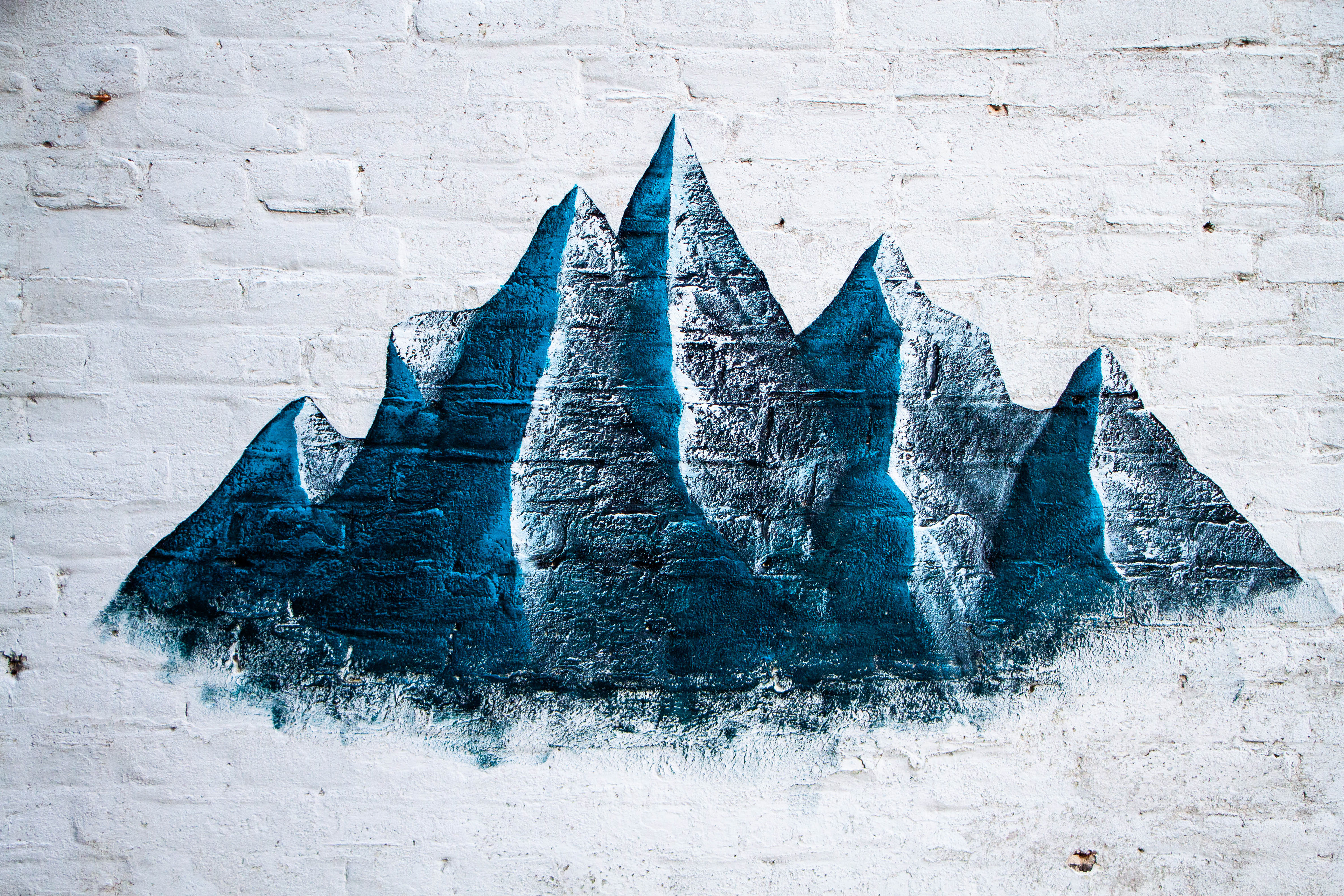
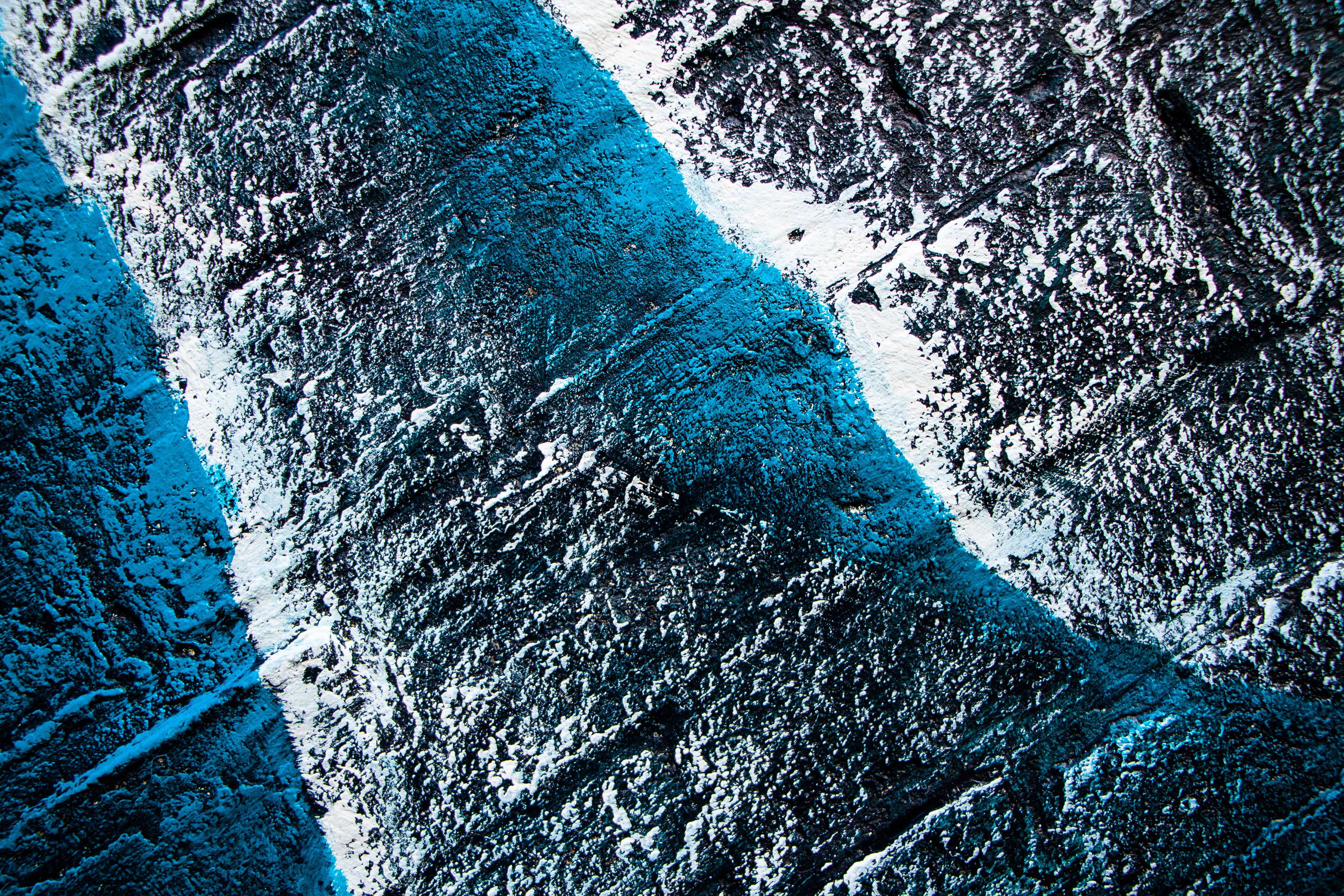
I MOUNTAIN
For the first design, I wanted to paint a snowy mountain range. I've been compelled by the idea of the sublime in nature for years: the simultaneous feeling of awe and overwhemling smallness brought on by the experience of nature; how you can revel in its beauty and at the same time feel so small in comparison to it. The fact that it's taken hundreds of years to form something so majestic puts your own mortality and life span into perspective, it becomes humbling.
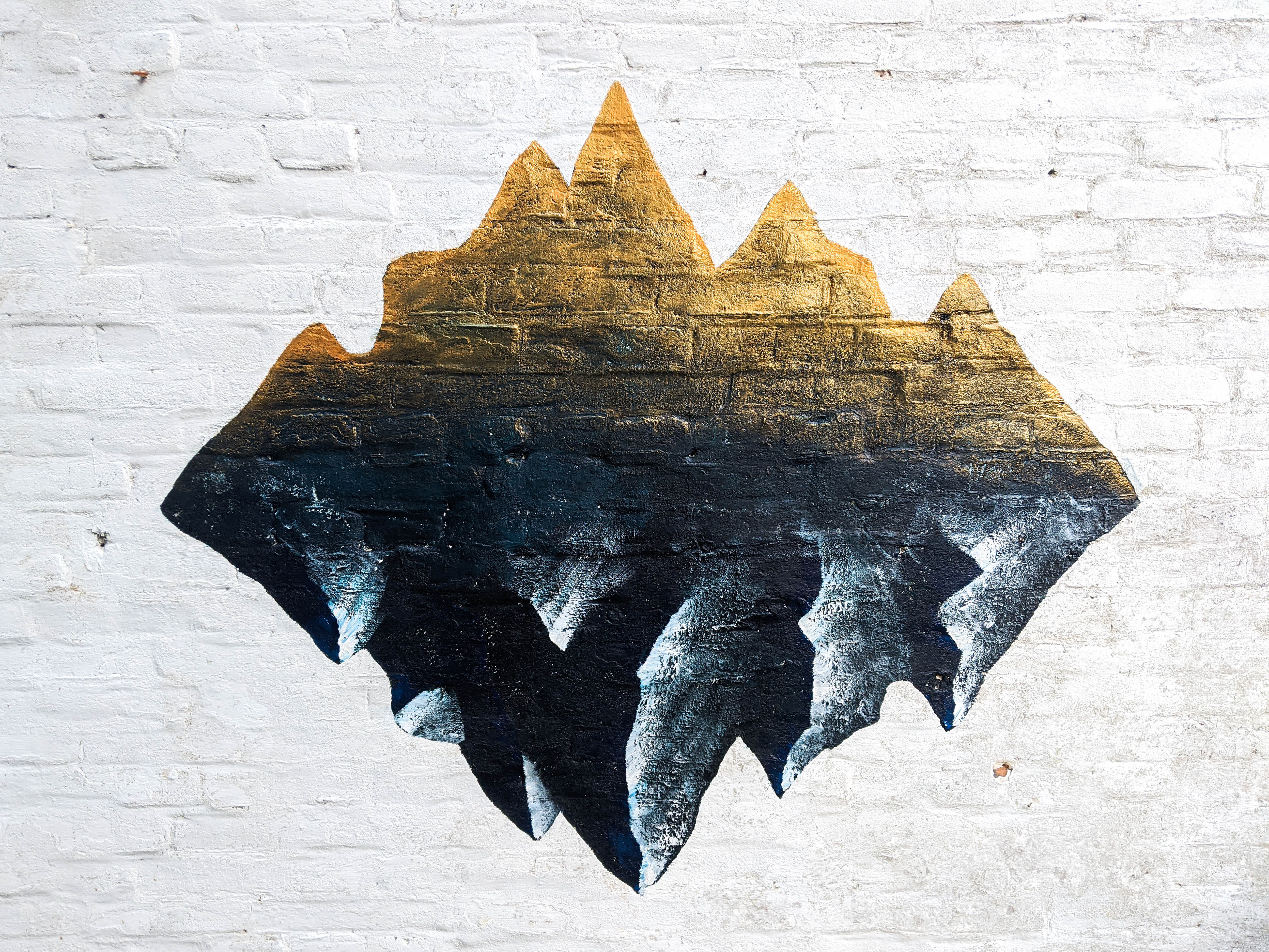
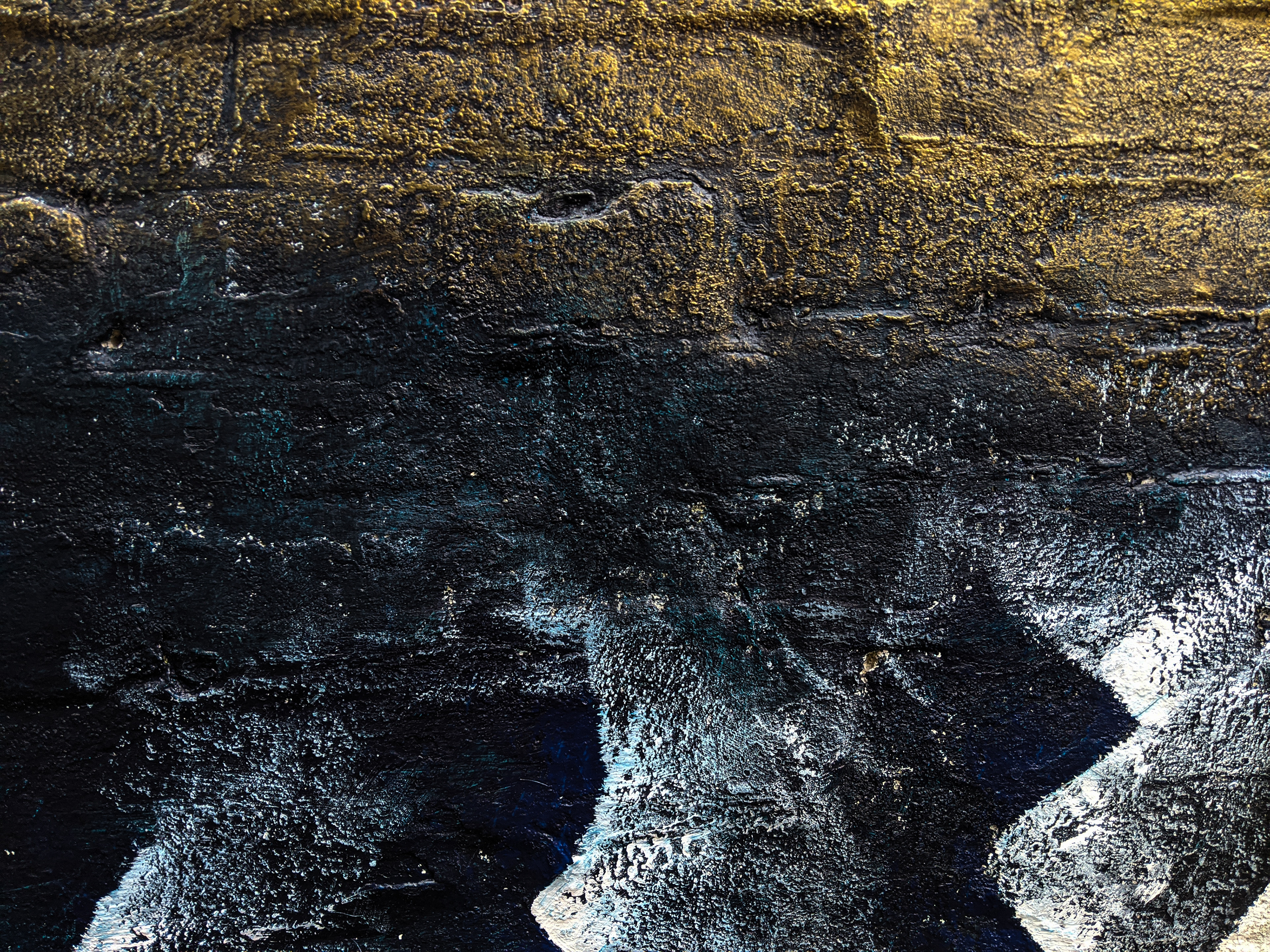
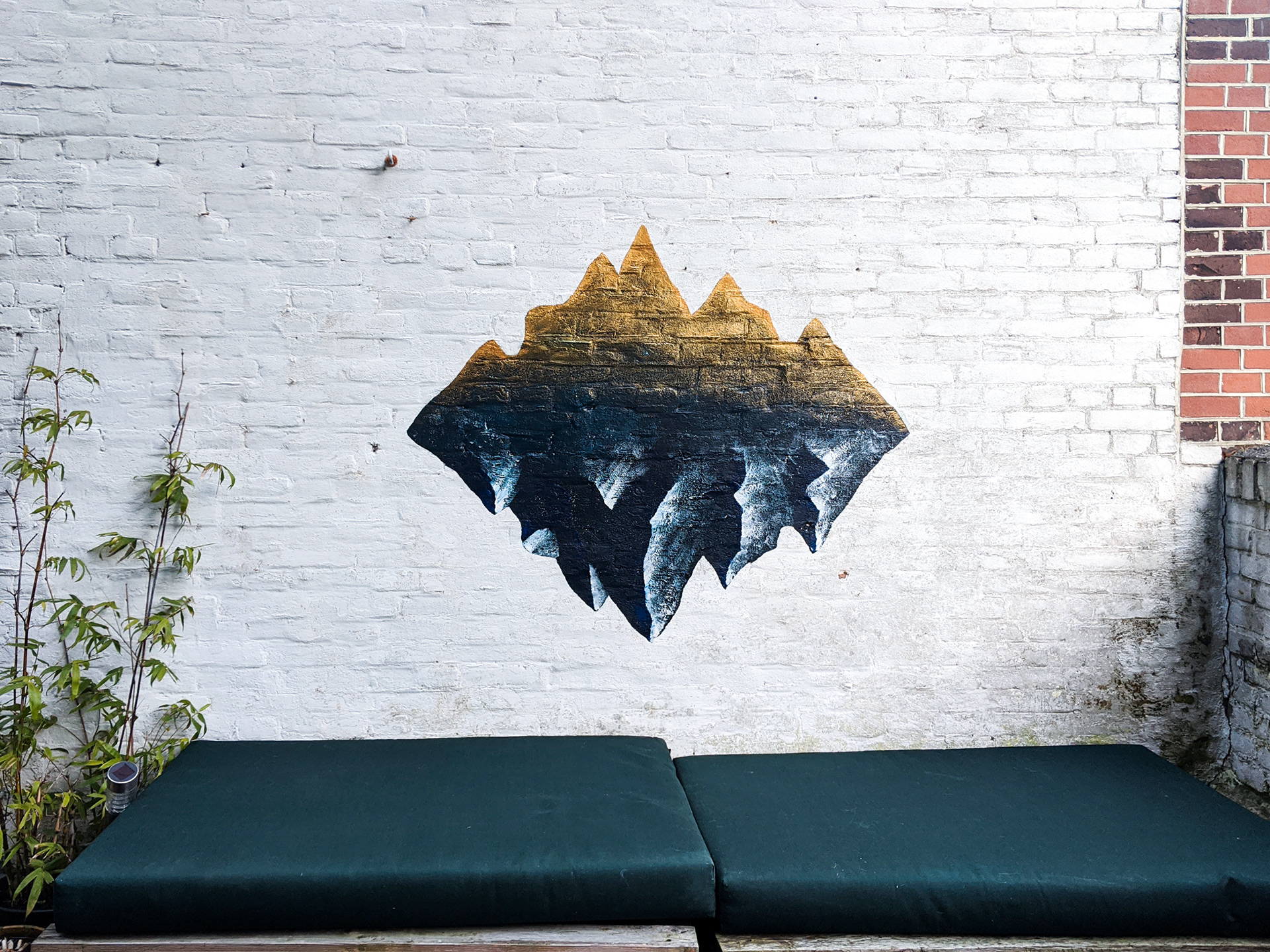
II GOLD ISLAND
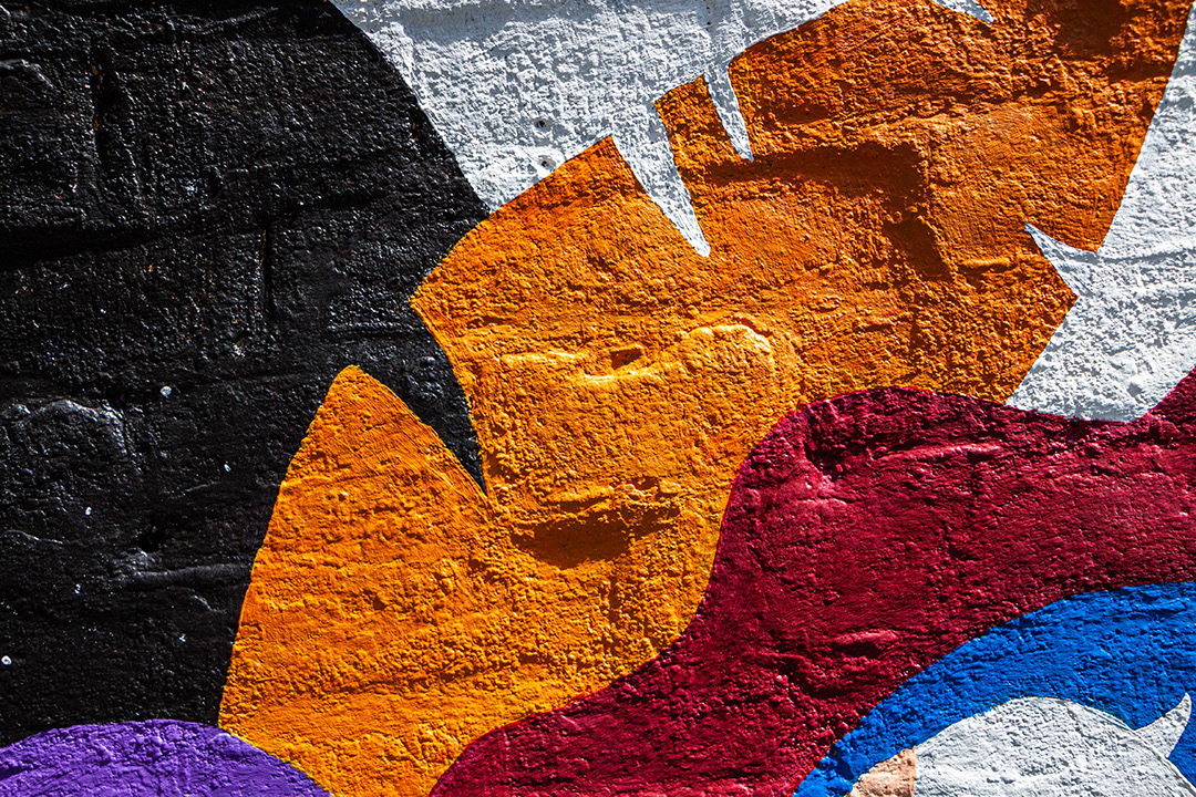
For mural II, I wanted to test out a gold metallic paint. I mirrored the mountain range on the bottom to create a whole solid figure, then painted the top half fading into gold, creating an upside-down island floating in mid air.
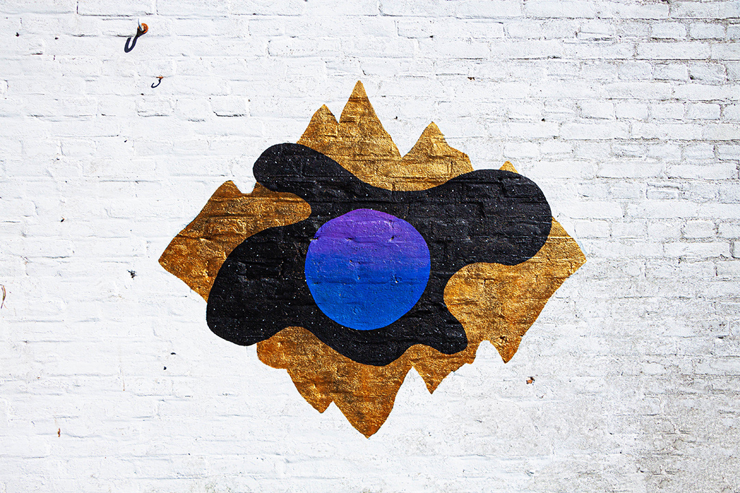
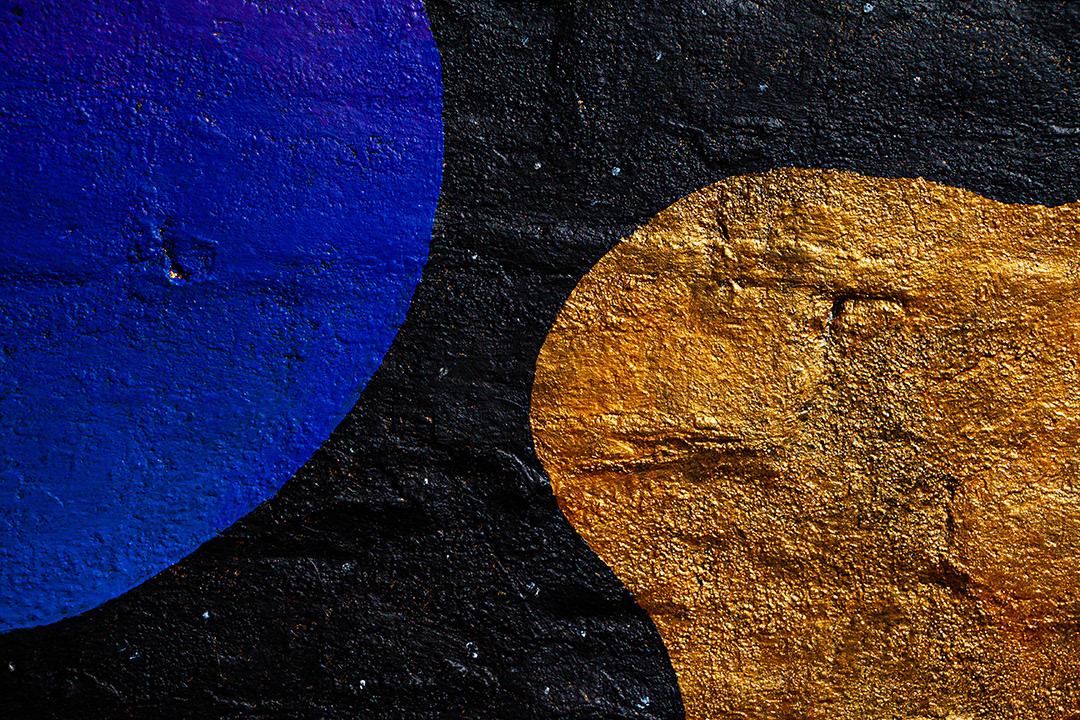
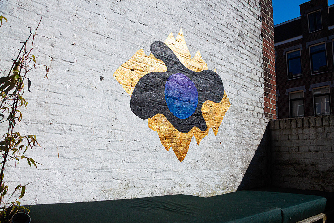
III COSMIC SKIES
The element I wanted to keep from the previous design was the gold paint, so for mural III I painted the entire design gold as a base layer to start with. I then added a night sky contained within a flowing organic shape, and the final top layer as a circle gradient fading from purple to blue. The circle becomes a sort of sun at the center of this cosmic shape.
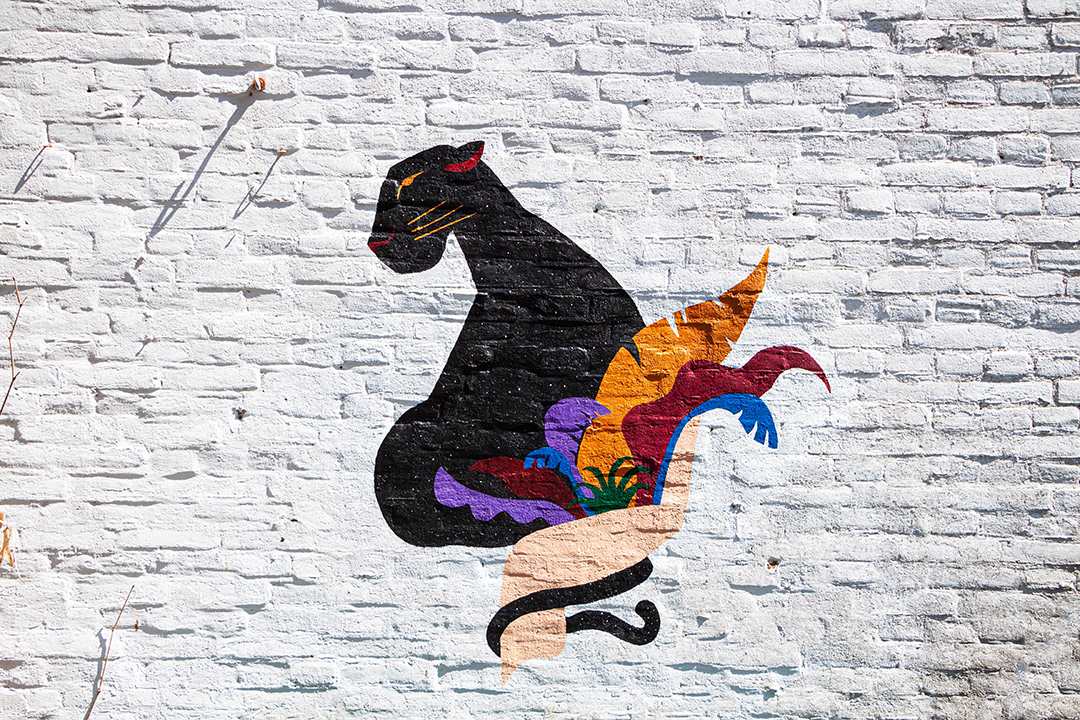
IV HARMONY
In celebration of the 50th anniversary of Earth Day and to encourage others to remain in their homes (reducing the risks of spreading COVID-19), nonprofit organization PangeaSeed held HOME: a stay-at-home mural festival. Artists were invited to paint a mural in the safety of their own homes.
The pandemic of COVID-19 has allowed us to re-evaluate how humanity is coexisting with our planet. Our negative impacts are undeniable, and hopefully after the pandemic we can make better choices that will reduce our destructive tendencies.
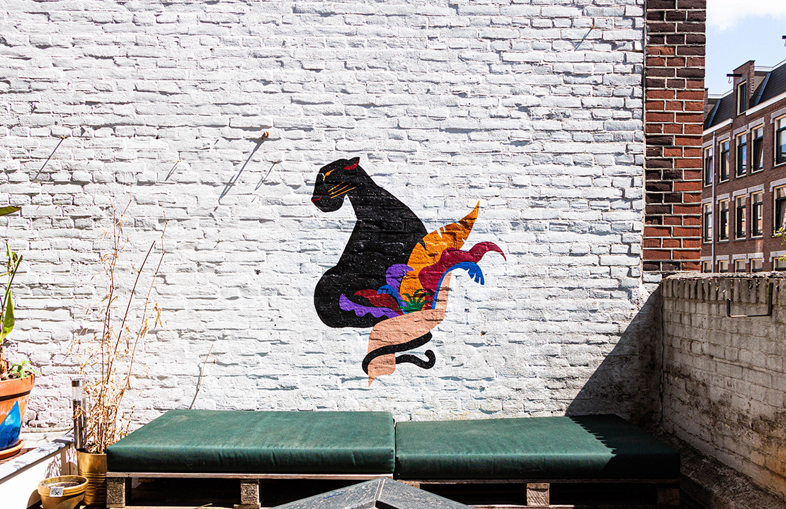
My final composition shows a human hand holding a panther along with bright colorful leaves, symbolizing how humans and nature must collaborate in order to live in harmony. I was really pleased with the look of the night sky from the previous mural design, so for this one I extended that into the panther shape. The vivid colors and references to nature remind me of the Brazilian jungle and folkloric art, so it was nice to make that connection with my heritage.
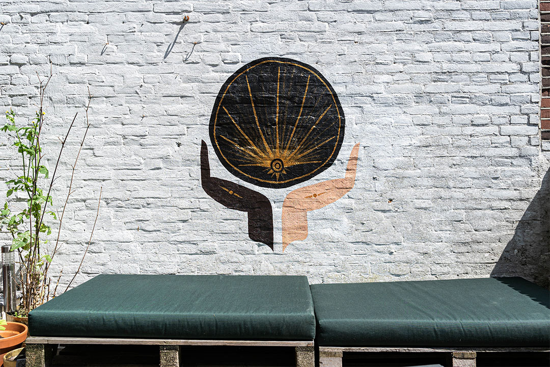
V UNITY
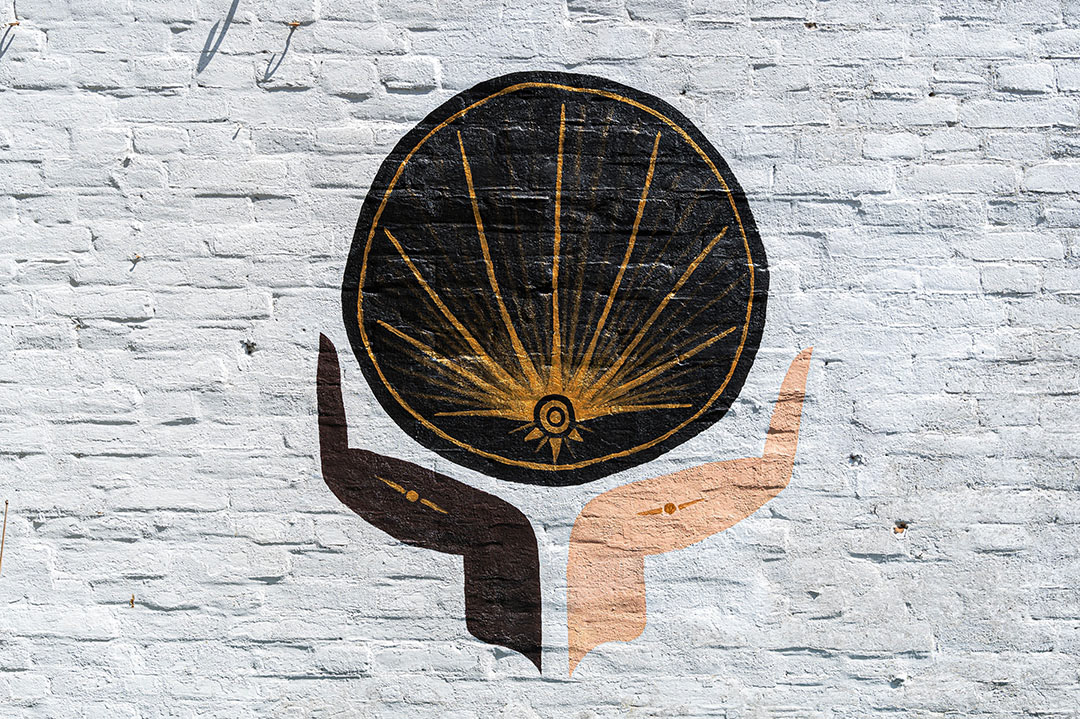
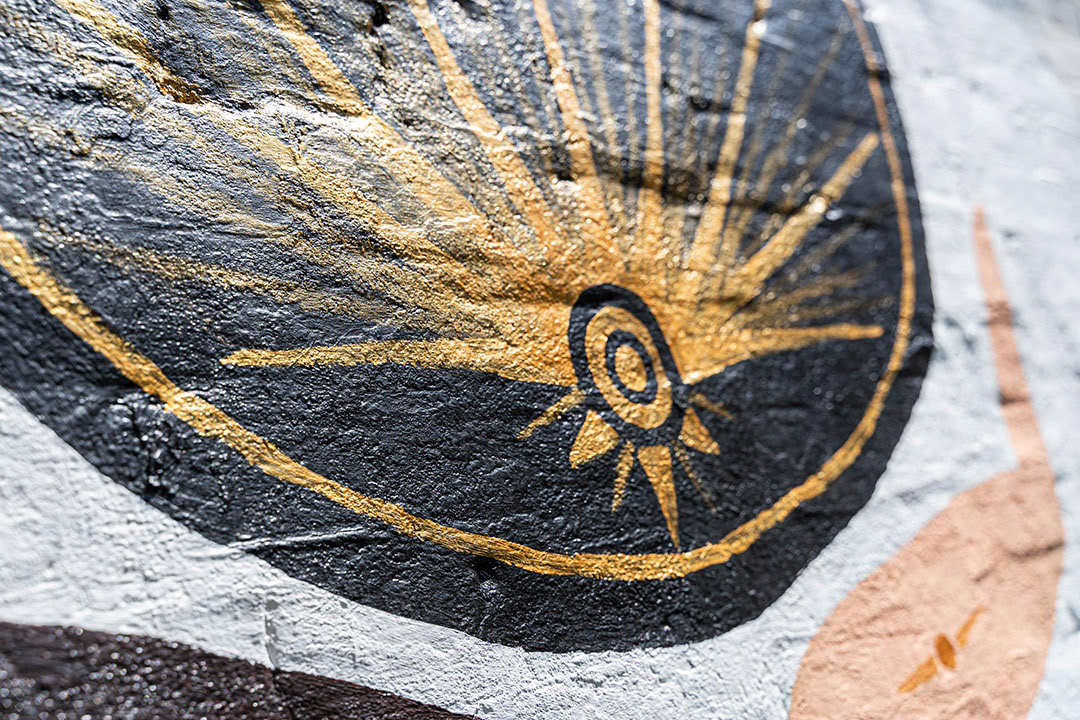
In support of the Black Lives Matter movement that has been more prevalent in June 2020, the theme of this design is to encourage unity and anti-racism. We are not all the same, but we are all equal. The design shows two hands, one black and one white, uplifting an abstract golden geometric pattern held within a black circle. Maybe the golden lines represent a sun, maybe the black circle represents the universe. There are also little golden details within both hands connecting the two to the golden design, representing how we all affect each other to form the reality we live in. I took the hand as my chosen element from the previous mural design to carry onto this next one, mirroring it.
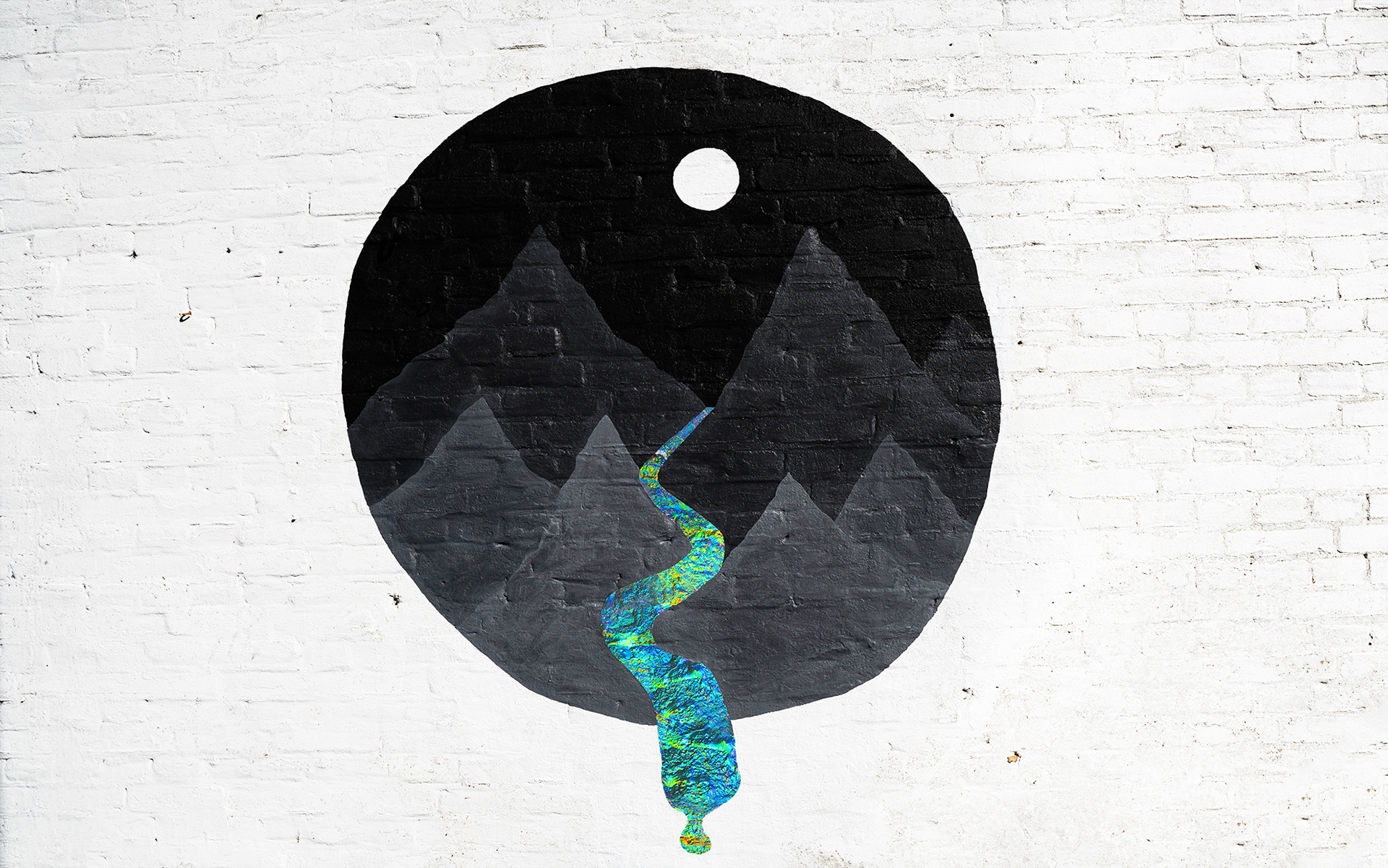
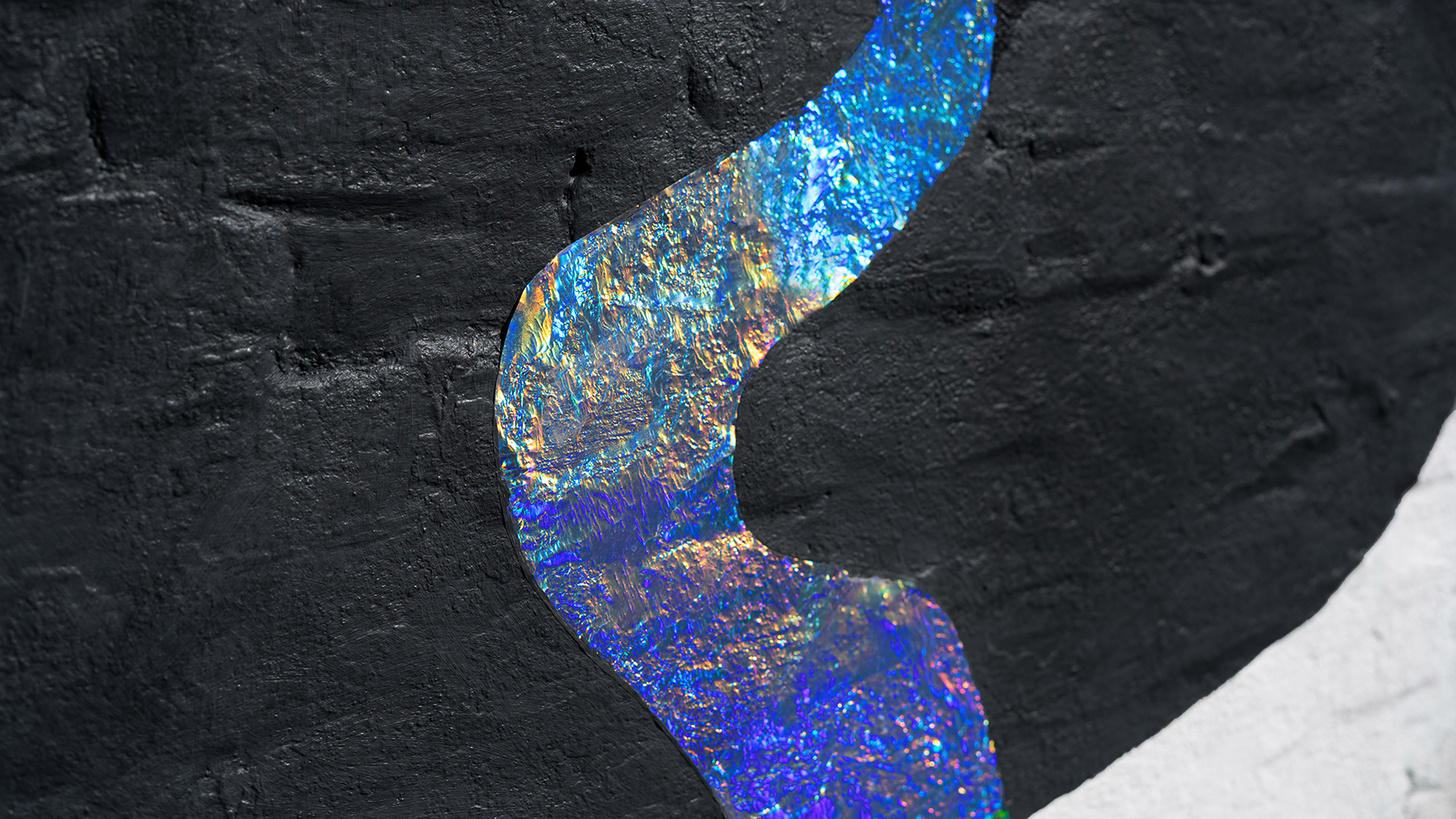
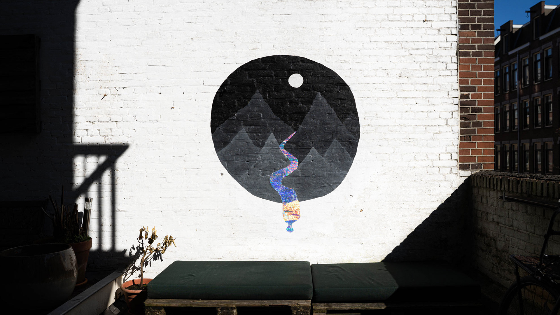
VI MELTING
Wanting to test out a new material, I used a holographic sticker as the (literal) highlight of my next mural design. I kept the circular shape from the previous design, but I enlarged it. I then added mountains and a moon, all in a grey color palette so the holographic river would really stand out. Initially the sticker was a very flat layer that felt contrasting to the rest of the mural. But after one day of rain, it shrunk and took on the texture of the wall behind it. This actually gave the water a more realistic texture, blending it more naturally into the whole wall design. It's funny how sometimes accidents can enhance an artwork. It's important to stay open and flexible to adapt work as it evolves.