COACHING // WELLBEING
Visual Identity
Brand strategy
Logo design
Icon design
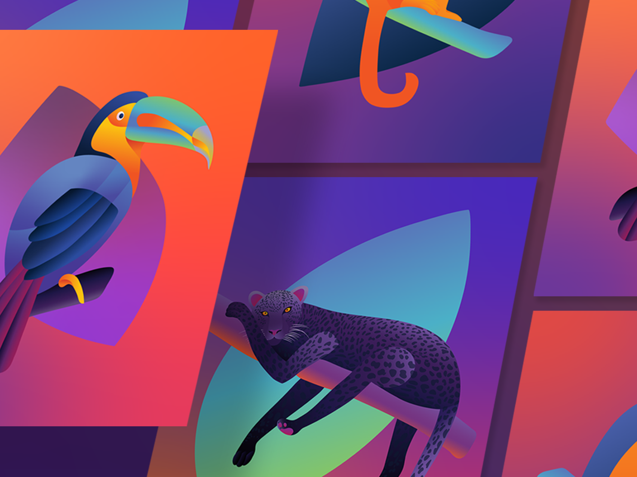
Custom illustrations
Qualia Quest helps organisations build psychologicaly safe, resilient, high-performing teams through transformative experiences. Offering individual, team and organizational development, coach Zulfi Malik acts as a catalyst for transformation in his clients.
The brand identity for Qualia Quest is inspired by the story of Mary's Room, a philosophical tale. Mary used to see in black and white; one day she discovered color, and her whole world changed. Qualia Quest's aim is to be that catalyst of change to its customers. It reflects you back to yourself from a different perspective, it triggers awareness & understanding, and it encourages a continuously questioning mindset.
The visual expression of Qualia Quest embodies cosmic elements, reflecting the ambiguous nature of these internal and existential contemplations. Colors merge into one another rather than contrasting with defined shapes and lines, part of an open exploration from one point to another.
Logo Design
The imagery designed for Qualia Quest's logo is two faces intersecting. The face on the left is drawn with rigid angles in black and white, while the face on the right is free-flowing and vividly coloured with a wide spectrum.
The black and white face represents a person before they undertake this journey: they're in the dark, unaware, following rigid structures that they or others may have imposed on themselves. The colorful face represents the person after their transformational experience: enlightened, seeing all of the options in colors available to them, empowered to make their own choices, embodying a greater sense of freedom. The shape also expresses this with its curved, organic, natural lines, carving their own path.
The intersecting element of the design is significant, as the person who entered and the person who is exiting are still connected. They do not forget who they were, and they do not transform into an entirely new person; they reconcile the two in a combination that makes the most sense for them to continue on their journey in a constructive way. They are simultaneously both people.
In the logo design, the shapes and colors combined reflect the ambiguous quality of the quest; there is no one clear or correct shape, but rather an approach that can assist with guidance.
Icon set
The custom icons used throughout the Qualia Quest website use the eye (a universal symbol of insight and perception) to represent the self—an ongoing journey of discovery, awareness, and transformation. Each icon is a reflection of a different stage or perspective in that journey.
Branding Assets
